

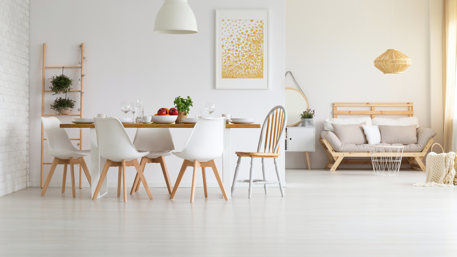
Neutral tones in home décor create a serene and elegant atmosphere, making them a popular choice for many homeowners. To effectively use neutral tones, one should focus on balancing shades, textures, and patterns to create a cohesive look. Incorporating various elements can enhance the overall appeal without overwhelming the space.
One way to achieve this is by mixing different neutral shades, such as beiges, greys, and whites, while adding texture through fabrics and materials. Natural fibres, wood finishes, and stone accents can provide depth and interest to the design. This approach allows for a calm environment while still offering opportunities for personalisation.
Additionally, incorporating accents in bolder colours or decorative items can invigorate the neutral palette without overshadowing the tranquil foundation. By thoughtfully selecting furnishings and accessories, they can enjoy a space that feels both grounded and stylish.
Understanding Neutral Tones in Interior Design
Neutral tones play a crucial role in home décor, offering versatility and tranquillity. Their subtlety allows for various combinations and influences the overall atmosphere of a space deeply.
Defining a Neutral Palette
A neutral palette consists of colours that create a calming background for other elements in a room. Common neutral tones include:
- Beige
- Grey
- White
- Taupe
- Cream
These shades serve as a foundation, allowing for personalisation with accents and textures. Unlike bold colours, neutral tones do not overpower a space. Instead, they promote a serene and cohesive environment, making them ideal for various interior styles, from modern minimalism to traditional elegance. The choice of light or dark neutrals can significantly influence the mood within the room.
The Impact of Neutral Colours on Mood and Space
Neutral colours foster a tranquil atmosphere, encouraging relaxation and comfort. They can help make a space feel open and airy, especially when lighter tones like whites and creams are used. This can be particularly beneficial in small rooms or those with limited natural light.
In contrast, darker neutrals such as charcoals and deep browns can add warmth and sophistication. Combining different neutral shades can create visual interest without overwhelming the senses. Textures such as wood, fabric, and metal further enhance the ambiance, complementing the neutral colour palette while maintaining a sense of harmony in the home décor.
Incorporating Textures and Materials
Incorporating textures and materials is essential for creating depth and interest within a neutral décor scheme. This approach not only enhances the aesthetic but also contributes to a warm and inviting atmosphere.
The Role of Texture in a Neutral Decor
Texture plays a crucial role in neutral décor by adding dimension without relying on colour. Various materials can create a balanced visual experience.
- Soft Furnishings: Plush cushions and throws provide comfort and warmth. Fabrics like linen and wool add sophistication.
- Textured Ceramics: Vases and pots with unique surfaces introduce intrigue. They can be used as focal points or accents.
- Layering: Combining smooth and rough textures, such as sleek wood furniture alongside woven rattan, promotes visual contrast. This approach helps draw attention to specific areas within a room.
Through careful texture selection, a neutral palette can feel dynamic rather than flat.
Choosing Natural Materials for Warmth and Visual Interest
Natural materials significantly enhance the atmosphere in neutral décor. They introduce organic elements that resonate with warmth.
- Wood: The rich variations in wood tones contribute character. Light woods like oak offer a bright feel, while darker woods can provide a grounded, earthy vibe.
- Rattan: This material brings an informal elegance. It works well in various furnishings, from chairs to decorative baskets.
- Textured Finishes: Opting for pieces with natural imperfections can create a sense of authenticity. Imperfect finishes on ceramics or wooden furniture invite tactile exploration.
Using these materials carefully will create a cohesive and inviting space that highlights the beauty of neutrality.
Furniture and Accessories in Neutral Decor
In a neutral-themed space, the right furniture and accessories can enhance the tranquil aesthetic. Choosing the right elements can ensure a cohesive look that promotes serenity and elegance.
Selecting Furniture for a Neutral-Themed Space
When selecting furniture, opt for pieces that embody simplicity and elegance. Oak furniture is an excellent choice, as its warm tones complement neutral palettes beautifully.
Look for clean lines and minimalistic designs to maintain a cohesive vibe. Sofas in soft taupe or cream can serve as a stunning focal point without overwhelming the space.
Furthermore, many homeowners choose to update their existing wood pieces instead of buying new items. This is a practical way to keep the quality of older builds while changing the look to match a neutral room. For those in the area, working with FHG Fine Finishes in Beaumont helps achieve a professional look on kitchen cabinets or heirloom tables. Refinishing these surfaces allows the natural grain to show or covers it with a smooth, solid cover. It makes the furniture fit better with modern, light-colored walls. This process saves money and keeps well-made furniture in the home for longer.
Incorporating natural materials adds warmth and texture. Consider items like wooden coffee tables or upholstered chairs with Egyptian cotton fabric for comfort and durability.
Remember, the goal is to create a harmonious environment. Pieces should support, not compete with, the overall aesthetic.
Accessories and Decorative Items to Enhance Neutrality
Accessories are vital for bringing a neutral space to life without cluttering it. Choose decorative items in subtle tones to maintain balance.
Textiles such as cushions and throws in light greys and soft beiges provide warmth and comfort. Installing Window Shades in complementary hues can further enhance the overall harmony of the room, offering both functionality and visual appeal. Introduce varied textures, such as woven baskets or ceramic vases, to add depth without straying from the neutral theme.
Lighting can also play a crucial role. Soft lamps with warm bulbs create a cosy atmosphere, enhancing the neutral colours.
Art pieces should be thoughtfully selected; abstract pieces in muted colours can serve as attractive focal points. Aim for a blend of subtle contrasts to keep the space engaging while remaining true to the neutral aesthetic.
Colour Schemes and Complementary Colours
Neutral tones create a versatile base for any décor style. With the right colour palette, they can enhance the aesthetics of a space, particularly when incorporating complementary colours and architectural details.
Working with a Base of Neutral Tones
When starting with neutral tones, she can choose from a variety of shades, including cool greys, warm neutrals like beige and taupe, or rich earthy tones such as terracotta. These options offer a sophisticated backdrop that can suit various design themes.
To establish a cohesive look, pairing neutral tones effectively is crucial. For example, combining warm neutrals with cool tones can create visual balance. She can also utilise layers of similar shades to add depth and interest in a neutral room.
Selecting the right neutral undertones will affect the overall vibe. Warm tones create a welcoming atmosphere, whereas cool neutrals promote calmness. This choice sets the stage for integrating bolder colours later on.
Integrating Bolder Colours and Architectural Details
Bolder colours can energise a neutral space when carefully selected. Popular choices include deep blues, rich greens, or vibrant coral tones. These hues add striking contrast while allowing the neutral base to shine.
Architectural details, such as moulding, beams, or even textured walls, can also enhance the overall design. By accentuating these features with a colour that complements the neutral tones—like a charcoal or navy—she can draw attention and create dimension.
Consider the use of furniture and accessories in bolder colours. For instance, a statement armchair in a warm tone can pop against a taupe backdrop. This approach maintains harmony while introducing fascination into the décor.


Leave a Reply